Unix performance reporting with tikz/pgfplot
I became tired using excel to create performance reports and decided to invest some time in creating a template in LaTeX using the fabulous pgfplots package. Since I couldn’t find a suitable example anywhere on the net I’ve decided to share mine here.
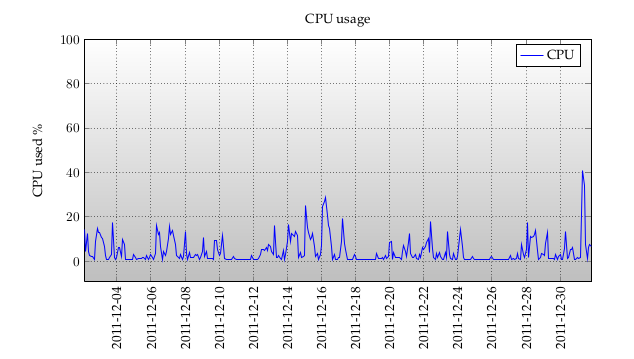
Each month I receive bundle of performance statistics from 15 vmware servers which I convert to data looking like this:
2011-12-02 02:00:00, 14.43
2011-12-02 04:00:00, 4.49
2011-12-02 06:00:00, 12.33
2011-12-02 08:00:00, 4.23
2011-12-02 10:00:00, 2.49
2011-12-02 12:00:00, 2.26
2011-12-02 14:00:00, 2.32
2011-12-02 16:00:00, 0.99
2011-12-02 18:00:00, 8.85
2011-12-02 20:00:00, 14.81
...
The extract above is cpu usage of the server every second hour for a month.
\documentclass{minimal}
\usepackage[danish]{babel}
\usepackage[utf8]{inputenc}
\usepackage{palatino}
\usepackage{filecontents}
\usepackage{tikz,pgfplots}
\usepgfplotslibrary{dateplot}
\definecolor{NNITRed}{RGB}{140,0,0}
\definecolor{pengreen}{RGB}{180,204,168}
\begin{document}
\pgfplotstableread[col sep=comma]{/home/regj/code/pyx/data/csv/server.cpud3}
\cputable
\begin{center}
\begin{tikzpicture}
\begin{axis}
[
title=CPU usage,
axis background/.style={fill,bottom color=gray!50,top color=white},
grid=major,
grid style={dotted,black},
width=15cm,
height=8cm,
date coordinates in=x,
date ZERO=2011-12-02 02:00:00,
xmin =2011-12-02 02:00:00,
xmax =2011-12-31 20:00:00,
xtick=,
ymax=100,
ylabel=CPU used \%,
xticklabel style={rotate=90, anchor=near xticklabel}
]
\addplot[blue] table[ y index = 1] from \cputable ;
\addlegendentry{CPU}
\end{axis}
\end{tikzpicture}
\end{center}
\end{document}
Which produces a graph (a very nice one at that IMO):